IBM

Increase masking rule comprehension and decrease issues raised by 10%

Increase masking rule comprehension and decrease issues raised by 10%

Problem:

We observed numerous GitHub issues related to user complaints about rules not functioning as expected. Upon investigation, we discovered that the rules were technically operating correctly; however, the users' expectations and intended outcomes did not align with the actual functionality. Our goal is to enable new users to create rules effortlessly within 5 minutes, ensuring the rules work as the user intended.


Opportunity:

This project aimed to draw inspiration from competitor products, analyzing their approach to rule creation from a UX perspective. Our goal was to enhance our own user experience based on these insights.

Role

Lead UX Designer & Squad Lead

Year

2022

Duration

2.5 months

Team

Technical PM, Dev team, Visual designer , User researcher

Technical PM, Dev team, Visual designer ,

User researcher

Deliverables

Competitive Analysis

User research

Prototypes

Executive presentations

Final specs

Roadmap

Impact

Increased rule creation comprehension

Decreased customer service request

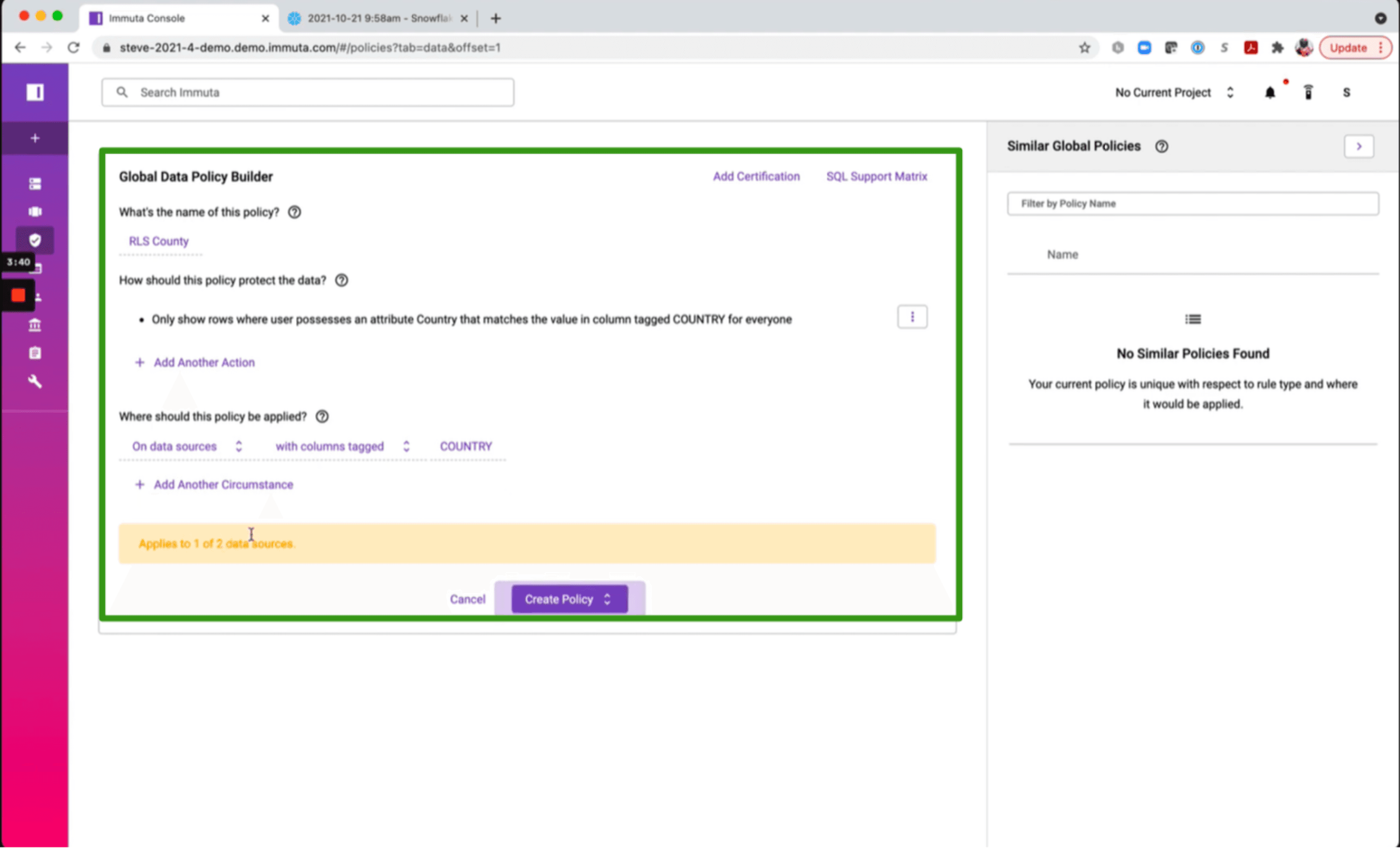
IBM’s Current data protection UI

rubric
rubric
rubric

Key Problems:

  1. Lack of feedback to the user about the rules they create

  2. Content does not provide guidance on how to build a rule.

  3. Rules UI is not visually streamlined

Process

I initiated the process by developing a heuristic rubric to conduct a competitive analysis of our product alongside key competitors. These were quick heuristics we can use to analyse our competitors.

I initiated the process by developing a heuristic rubric to conduct a competitive analysis of our product alongside key competitors. These were quick heuristics we can use to analyse our competitors.

rubric
rubric
rubric

Findings

I found 3 key areas within our competitors missing from our product.

I found 3 key areas within our competitors missing from our product.

Based on insights gathered from competitors, I started creating mockups of ideas we learned from our research

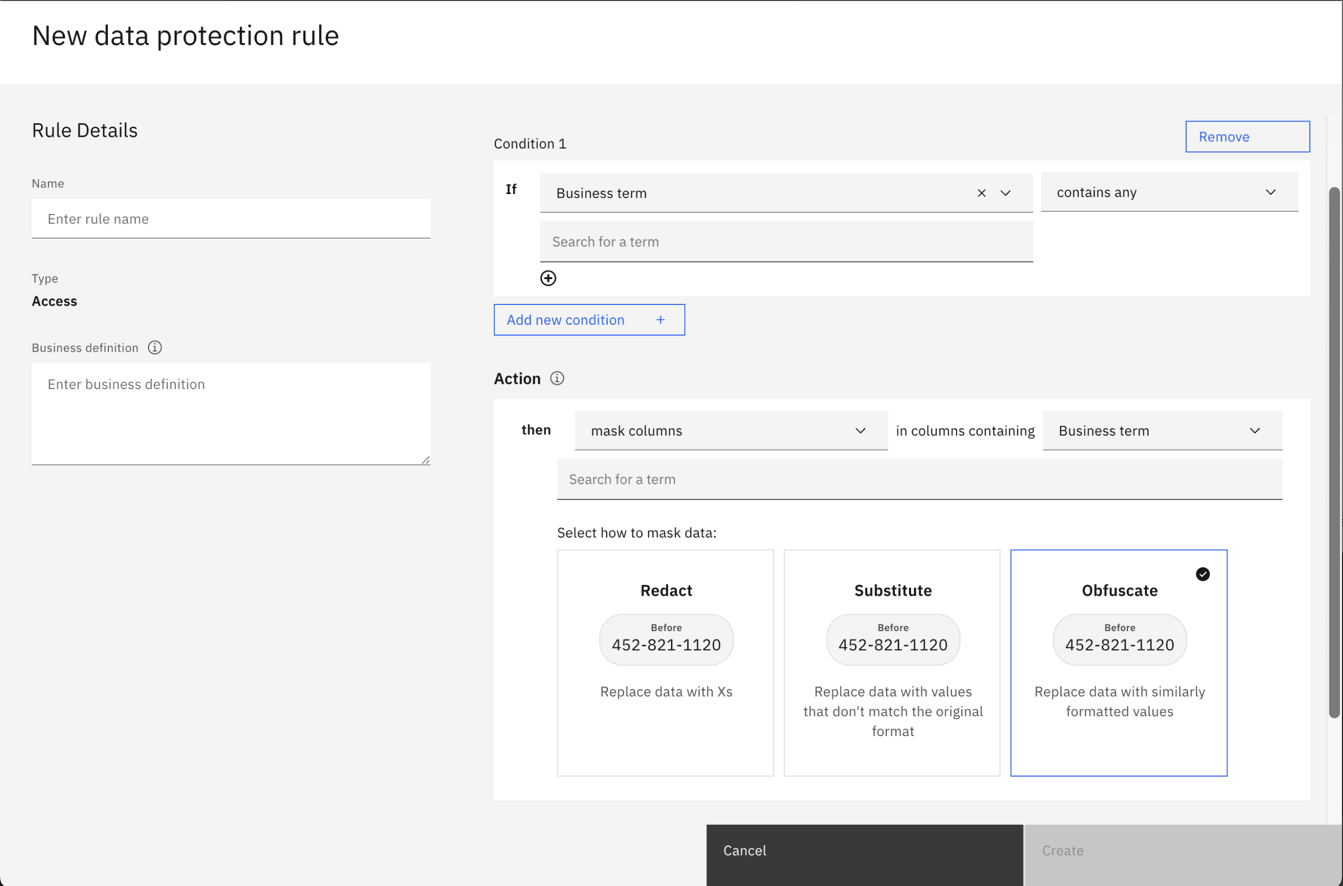
An important insight we gained was the ability to summarize rules in plain English, a feature prevalent among our competitors and highlighted transparency. This proved highly valuable in helping users understand the rules they were creating

rubric
rubric
rubric

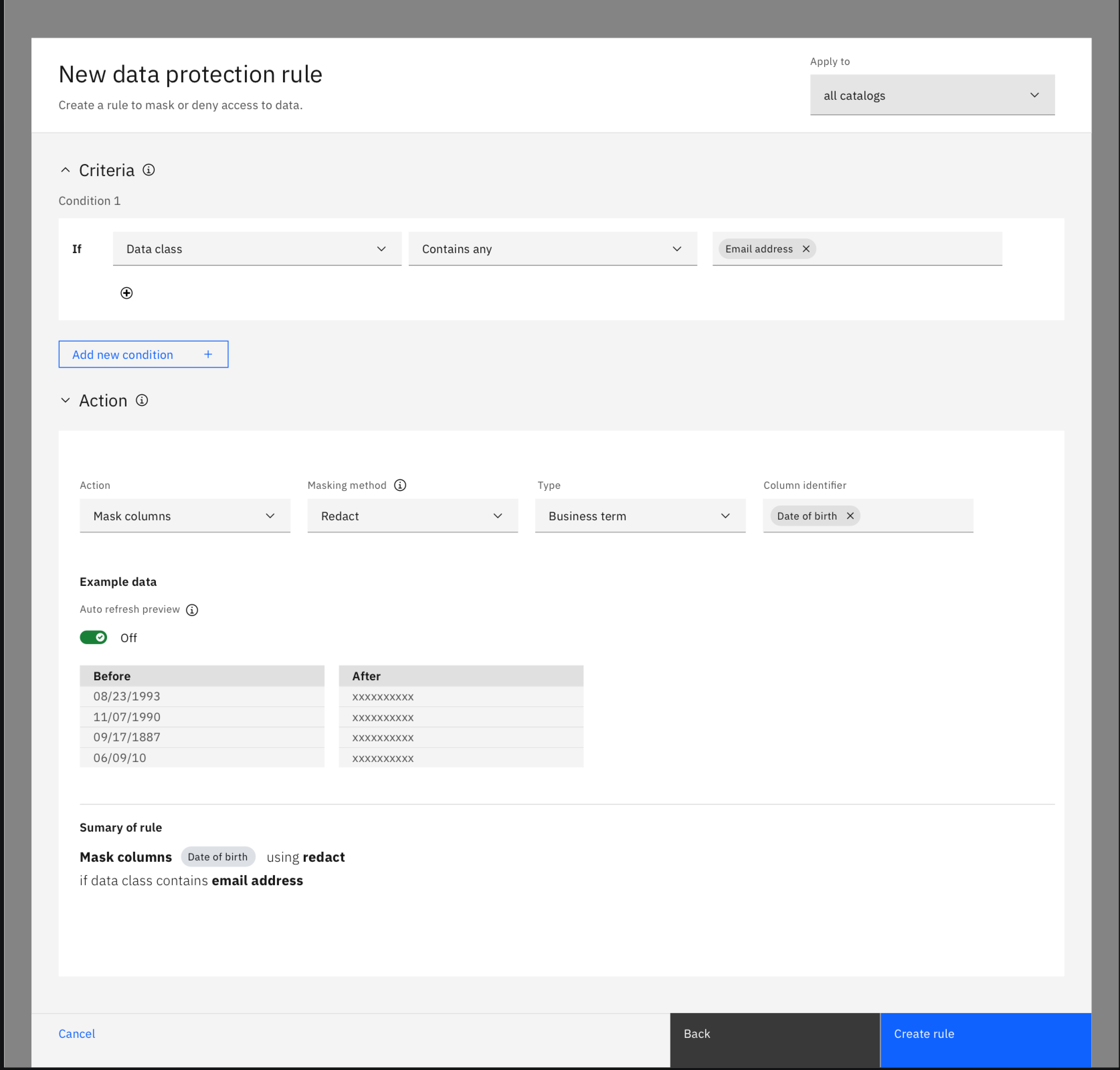
Adding the "Summary of rule" in plain english created the sense of system feedback important to our users to make sure theyre creating valid rules.

Another important system status and feedback exploration was on clearly displaying where each rule would be applied. This critical feedback was missing in our original design, which created a disconnect for our users.

rubric
rubric
rubric

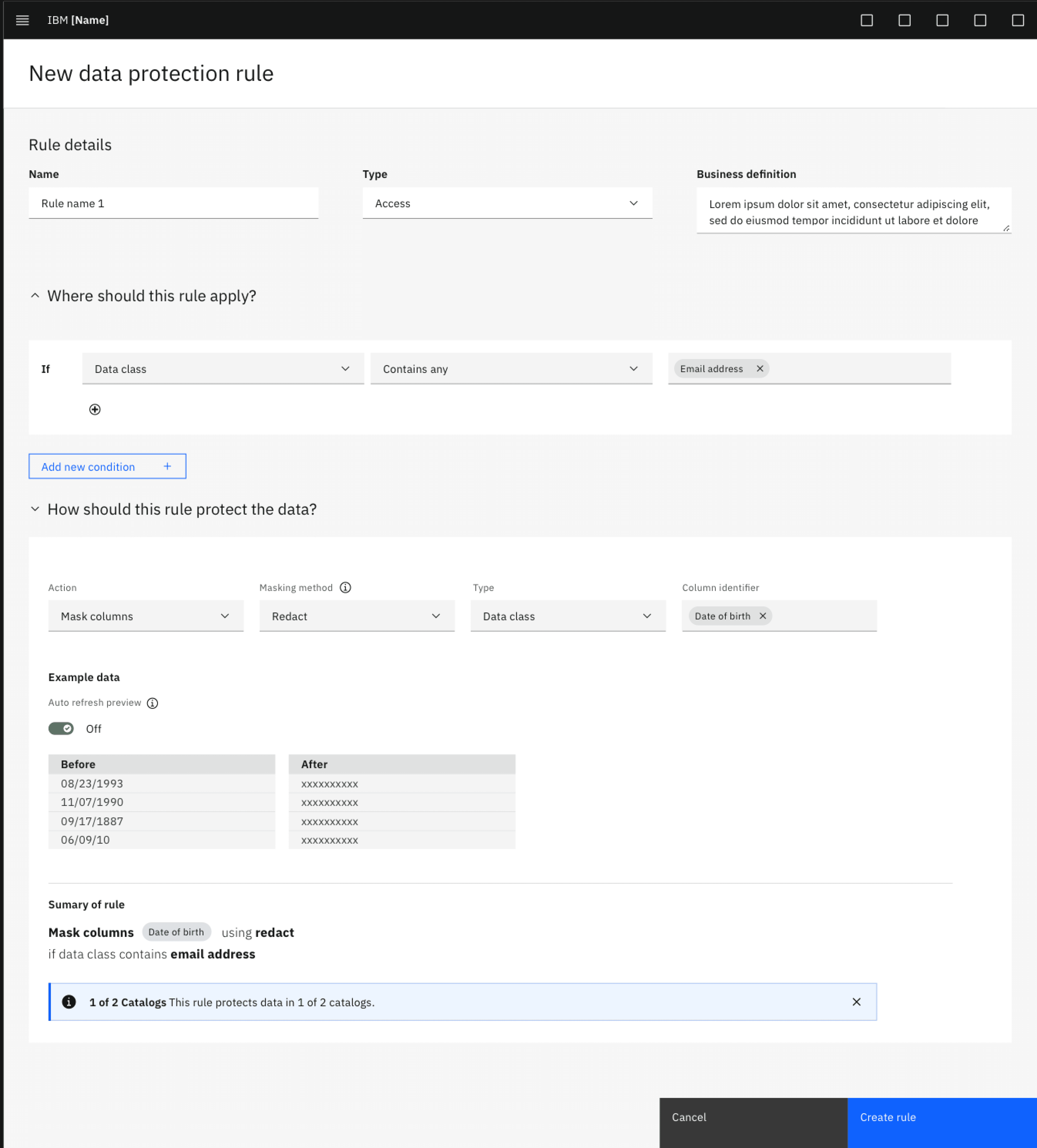
Adding the blue banner signifying where the rule would be applied to helped demystify where the rule would be applied to in a users catalog.

To streamline our UI, we decided to separate the "rule details" from the actual rule creation step. This provided users with a more focused area for rule creation, reducing unwanted noise in the UI.

rubric

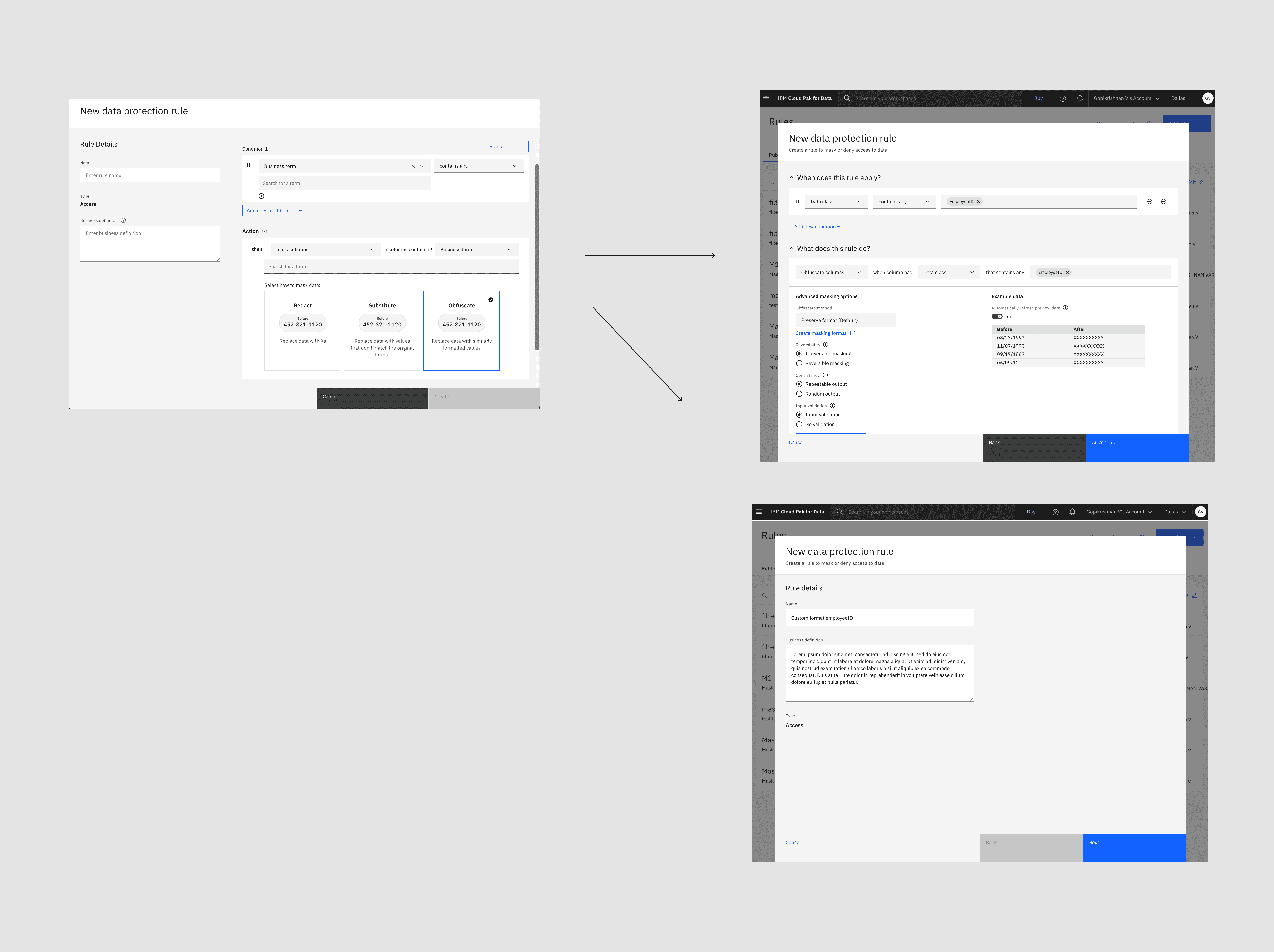
I developed a two-step wizard experience, which improved and streamlined the design while creating consistency across IBM. All creation flows were integrated into this new wizard format to ensure uniformity and ease of use.

Another important insight we gained was the role of content in guiding users. Instead of using technical terms like "condition" and "action," we adopted a more human-centered approach. We revised the content to say "When does this rule apply?" and "What does this rule do?" to better assist users in creating rules.

rubric

I worked with my content design partner to come up with more user-friendly terms to replace "condition" and "action."

Next steps

After presenting our ideas to the product manager and development team, we collaborated using Airtable to prioritize and phase out some of our concepts. We employed a sizing approach—cupcake, birthday cake, and wedding cake sizes—to categorize the ideas. The development team was able to provide rapid feedback on the development effort required for each idea.

rubric
rubric
rubric

This approach worked well, and within a few days, we had a realistic roadmap that aligned the entire team.

Final designs

Unfortunately, due to tight constraints around resources and timelines, the team was only able to deliver the redesign of the UI and update the content. Although we could not move forward with some of the ideas pitched to our stakeholders, the top two items we hoped to implement were successfully completed

Unfortunately, due to tight constraints around resources and timelines, the team was only able to deliver the redesign of the UI and update the content. Although we could not move forward with some of the ideas pitched to our stakeholders, the top two items we hoped to implement were successfully completed

The redesigned UI fulfilled a broad organizational OKR focused on streamlining creation flows. The revised content was a collaborative achievement involving our content designers, product management, and design teams, resulting in a more human-centered approach to our rules UI.

Made with ❤️ and ☕️ by Victor Lara

Made with ❤️ and ☕️ by Victor Lara

Made with ❤️ and ☕️ by Victor Lara